
Wall paint colors are easier to choose when you stop asking which shade is “best” and start asking which one fits the room. In a Holly Springs home, flooring, cabinets, trim, daylight, lamps, furniture, and sheen can all change how the same color reads from one room to the next.
This guide uses a five-check process to narrow the choices before you buy paint: fixed finishes, daylight, artificial light, room use, and sheen. The 2026 color directions can give you ideas, but the room itself should make the final decision.
Why the Paint Chip Is Only the Starting Point
A small chip shows the basic hue, but it does not show how that color will behave across an entire wall. Once the color is surrounded by flooring, trim, furniture, and natural light, the undertone becomes much easier to notice.
This is why a neutral can look beige in the store, pink beside a warm wood floor, or gray in a room with cool daylight. The paint did not change. The context around it did.
Instead of trying to find a color that looks perfect by itself, judge it beside the finishes that will stay in the room.
Check 1: Start With the Fixed Finishes
Flooring, tile, cabinets, stone, brick, trim, and large built-ins are harder to change than wall paint. Use those surfaces to narrow the color family first.
Check 2: Look at Daylight Before You Decide
Window direction, tree cover, neighboring buildings, and the time of day can all change the light reaching a room. That makes blanket rules about “north-facing colors” or “southern light” less useful than testing the actual space.
Place a sample where the wall receives the light you care about most. Check it in the morning, later in the day, and on a cloudy day if you have time.
A color that looks balanced at noon may feel too cool or too warm during the hours when you use the room most.
Check 3: Test the Color Under Your Real Light Bulbs
Artificial light has its own color appearance. The U.S. Department of Energy explains that lower correlated color temperatures produce warmer-looking light, while higher values appear cooler.
The Department of Energy also notes that changing the light source can change how objects and spaces appear. That matters when you are judging paint after sunset.
Do not approve the color using only daylight. Turn on the lamps, recessed lights, and fixtures you normally use and check the sample again.
Check 4: Decide What the Room Needs the Color to Do
Room function should narrow the palette instead of dictating one color family. A bedroom does not automatically need blue, and a living room does not automatically need beige.
Check 5: Pick the Sheen After You Pick the Direction
Sheen changes how light reflects from the wall, which can change how noticeable color variation, repairs, and texture become. A higher-sheen coating can make surface defects easier to see.
Durability and cleanability also vary by product, so do not assume every eggshell, satin, or matte performs the same way.
Alvarez Painting’s guide to satin versus matte paint explains how finish choice affects appearance and maintenance.
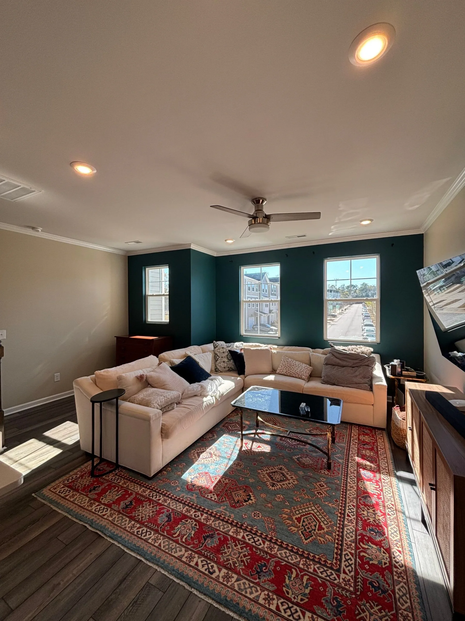
What 2026 Color Directions Can Tell You
Several major paint brands are emphasizing warmer neutrals, muted greens, and deeper earthy colors in their 2026 palettes. Sherwin-Williams selected Universal Khaki SW 6150, Benjamin Moore selected Silhouette AF-655, Behr selected Hidden Gem N430-6A, and Valspar selected Warm Eucalyptus 8004-28F as their 2026 Colors of the Year.
Those selections show a broad interest in grounded neutrals, greens, and deeper brown-based colors. They do not mean those colors belong on every wall.
Use them to identify a direction you like, then bring that direction back through the five checks before choosing the final shade.
Warm Neutrals Can Work When the House Already Has Strong Materials
Warm beige, khaki, mushroom, cream, and soft greige families can be useful when the room already has visible wood grain, stone, patterned flooring, or several furniture colors.
The wall can stay quiet while those materials carry more visual weight. The main risk is choosing a warm neutral that conflicts with a cooler fixed finish.
Compare the sample directly against the flooring and trim rather than judging the neutral by itself.
Muted Greens Work Best When Their Undertone Matches the Room
Sage, eucalyptus, smoky green, and gray-green families can pair well with natural wood, cream, black, brass, and many stone finishes.
The green may lean blue, yellow, or gray depending on the formula and surrounding light. That shift is why two greens that look similar on a fan deck can feel very different once they are on the wall.
Sample the green beside the largest fixed finish in the room before deciding.
Deep Colors Need Contrast More Than They Need a Large Room
Charcoal, brown, burgundy, deep green, and navy can work in smaller rooms when the trim, furniture, flooring, or lighting provides enough contrast.
Room size alone should not force you into pale paint. What matters is the balance between dark and light surfaces and how the room is used.
Test deeper colors at night because artificial lighting can change the mood more dramatically than it does with a pale neutral.
Primer Is a Surface Decision, Not a Color Rule
A dark-to-light color change does not automatically mean the whole room needs primer. Primer needs depend on the substrate, stains, repairs, porosity, existing coating, and the finish system being used.
Fresh drywall compound, bare material, stains, and certain repaired areas may need primer. A sound previously painted wall may not.
Alvarez Painting’s guide to preparing a house for paint covers the surface work that should be handled before finish color goes on.
A Better Way to Test Wall Paint Colors
Do not rely on one small chip or one digital room rendering. Use a sample large enough to see the undertone and move it around the room.
The goal is not to find a color that never changes. Every color shifts with light. The goal is to choose one you still like across the conditions in your home.
Interior Painting With Alvarez Painting
Alvarez Painting is a family-owned residential painting company that has served Holly Springs, Cary, Raleigh, Apex, Fuquay-Varina, Garner, Willow Springs, New Hill, Morrisville, and nearby communities since 2004.
Current company information lists 30 years of combined team experience, licensed and insured service, screened professionals, free estimates, free color consultations, clear communication, and a two-year workmanship warranty.
For homeowners ready to move from color testing to the full project, Alvarez Painting provides interior house painting services throughout the Greater Raleigh area.
Frequently Asked Questions About Wall Paint Colors
How do I choose wall paint colors for an open floor plan?
Start with the fixed finishes shared between the spaces, then choose colors that relate through similar undertones or repeat one neutral across connecting areas. The rooms do not have to be the same color.
Should every room use the same wall color?
No. Repeating one color can create continuity, but a coordinated palette can also work well. Keep flooring, trim, sight lines, and undertones in mind when colors change from room to room.
Do wall paint colors look darker after they dry?
Wet and dry paint can look different, but the amount and direction of the change depends on the product, sheen, lighting, substrate, and color. Judge the final sample after it has dried as directed.
What wall paint colors are popular in 2026?
Major brand palettes show interest in warm neutrals, muted greens, deeper browns, and other grounded colors. Treat those directions as inspiration and test them against your own finishes and lighting.
Do I need primer when changing wall colors?
Not automatically. Primer depends on the substrate, repairs, stains, porosity, existing coating, and the paint system selected for the project.